Walk into two gyms with identical equipment and pricing and you will still feel the difference immediately. One feels dialed in. Intentional. Calm but confident. The other feels fine, but forgettable. Like it was assembled over time by five different people who never spoke to each other.
That difference is not money. It is cohesion.
A cohesive gym brand does not scream. It whispers the same message everywhere. From the logo on the door to the wall colors to the way your front desk staff answers questions. When it works, members feel it before they can explain it.
This guide breaks down how to design a cohesive gym brand without turning into a design snob or hiring a fancy agency just to pick a shade of gray.
What A Cohesive Gym Brand Actually Is
A cohesive brand is not just a logo.
It is a system. A set of decisions that reinforce each other.
Your logo, color palette, signage, tone of voice, merch, website, and in-gym experience should all feel like they came from the same brain. Not the same template. The same point of view.
When those elements clash, members may not consciously notice, but they feel friction. When they align, everything feels easier. Trust builds faster. Referrals feel safer.
Cohesion reduces mental noise. And in a gym, where people already feel vulnerable, that matters.
Start With The Feeling, Not The Logo
Most gyms start backwards.
They open Canva. They pick a logo. Then they try to force everything else to match it.
Instead, start with one question.
How should someone feel when they walk into your gym?
Strong. Calm. Energized. Welcomed. Focused. Elite but approachable. Scrappy and gritty. Clean and modern.
Pick three words. Not ten. Three.
Those words become your filter. Every visual and verbal decision runs through them.
If your brand words are “calm, strong, precise,” then neon colors and aggressive fonts are probably a no. If your brand words are “high energy, bold, communal,” beige and whisper-quiet signage will feel wrong.
This step sounds abstract. It is not. It saves you from random decisions later.
Logos That Age Well Inside A Gym
Gyms are hard on logos. Sweat, chalk, sunlight, rubber flooring, screen printing, embroidery. Your logo has to survive all of it.
The biggest mistake gyms make is overcomplication.
Too many details. Too many lines. Too many clever flourishes that disappear the moment the logo is stitched onto a hoodie or slapped on a sign.
A strong gym logo usually has these traits.
It works in one color.
It works small.
It works on apparel.
It works on signage.
It does not need a tagline to make sense.
If your logo only looks good on a website header, it is not done yet.
Also, resist trends. Ultra-trendy logos date fast. A gym brand should feel solid five years from now, not like a 2024 mood board.
Color Palettes That Support Training, Not Distract From It
Color does more psychological work in a gym than most owners realize.
Bright colors can energize, but they can also fatigue. Dark palettes can feel premium, but they can also feel intimidating if overdone.
A cohesive palette usually includes:
One primary color that defines the brand.
One or two secondary colors for variation.
One neutral that dominates the space.
The neutral matters most. Floors, walls, equipment backdrops. This is where restraint pays off.
A good rule of thumb is this. If everything is loud, nothing is loud. Let one color speak and let the rest support it.
Also, consistency matters more than creativity here. Pick exact colors and stick to them. The same black. The same gray. The same green. When colors drift, cohesion erodes.
Signage That Feels Like Part Of The Brand
Signage is where many gyms quietly break their own brand.
The logo is clean. The walls are intentional. Then the signs show up. Different fonts. Clip art icons. Random tones.
Signage is not decoration. It is communication. And communication should sound like you.
Decide on one font family for signage. One. Use it everywhere.
Decide on one voice. Direct. Friendly. Motivating. Minimal. Then stick to it.
A rule that helps: write signs the way a great coach would speak. Clear. Encouraging. No fluff.
If your coach would never say “Please kindly refrain from leaving personal belongings on the floor,” your sign should not either.
Get The Branded Merch Playbook
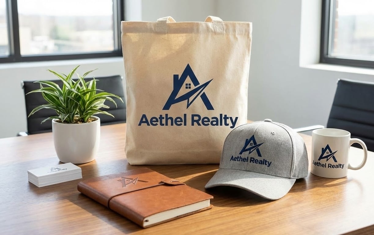
Cohesive brands do not stop at walls and logos. They extend into the physical items members carry out into the world.
The Branded Merch Playbook breaks down how to translate your gym’s visual and verbal identity into merch that actually gets used, worn, and remembered. It includes frameworks for choosing the right products, aligning design with brand tone, and pricing merch so it feels intentional instead of promotional.
Get the Playbook
Tone Of Voice Is The Hidden Glue
Tone is where most gyms accidentally split personalities.
The website sounds polished. The signage sounds stern. The emails sound awkwardly cheerful. The Instagram captions sound like a different company entirely.
Tone is not about being funny or serious. It is about being consistent.
Decide how your gym speaks.
Short sentences or longer explanations.
Direct or conversational.
Playful or reserved.
High energy or calm confidence.
Once you decide, document it. Even a simple one-page note helps. “We speak clearly. We avoid jargon. We sound encouraging but not cheesy.”
This matters because tone builds trust. When people hear the same voice everywhere, they relax. They know what to expect.
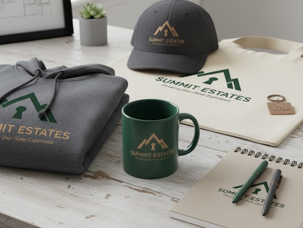
How Merch Fits Into A Cohesive Gym Brand
Merch is where cohesion gets tested in public.
Inside your gym, you control the environment. Outside, your merch has to stand on its own.
This is why cohesive gyms think about merch early, not as an afterthought.
Merch should reflect the same logo rules, color discipline, and tone as your space. A premium gym with thoughtful interiors should not hand out loud, low-quality shirts. A gritty, community-driven gym should not suddenly look sterile on apparel.
If you want to see how gyms successfully use apparel as an extension of their brand rather than a random revenue stream, this resource lays it out clearly: The Ultimate Guide to to Branded Merch for Gyms and Health Clubs.
The short version is this. If a member wears your merch to a grocery store, it should feel natural. Not like a uniform. Not like advertising. Like identity.
Consistency Beats Perfection Every Time
A cohesive brand does not require perfection. It requires discipline.
It is better to make a good decision and repeat it than to chase the perfect option every time.
This is especially true in growing gyms. New signs. New staff. New programs. New equipment.
Each change is a chance to either reinforce cohesion or slowly dilute it.
Ask one simple question before approving anything new.
Does this look, sound, and feel like us?
If the answer is unclear, pause. Clarity beats speed here.
How To Audit Your Current Gym Brand
You do not need a rebrand to improve cohesion. Often, you need an audit.
Walk through your gym as if you are new.
Look at the exterior signage.
The front desk.
The walls.
The bathrooms.
The website.
The emails.
The merch.
Do these things feel related or random?
Then pick three fixes that will make the biggest difference. New signage templates. Color cleanup. Tone alignment in communications.
Small changes compound fast when they are aligned.
When To Bring In Professional Help
Sometimes cohesion stalls because the vision is clear but execution is messy.
That is when outside help makes sense. Not to reinvent your gym, but to translate what already exists into a system.
If you want support building a cohesive brand across digital, physical, and experiential touchpoints, our team focuses specifically on that intersection: Paired Inc.
The key is finding partners who understand that a gym brand lives in real spaces, not just mood boards.
The Payoff Of A Cohesive Gym Brand
Cohesion does not just look better. It works better.
Members feel more confident inviting friends.
Staff feel more aligned.
Merch sells without being pushed.
Marketing feels easier because the message is already clear.
A cohesive gym brand reduces friction everywhere.
And in a business built on showing up repeatedly, reducing friction might be the most underrated advantage you can build.


0 Comments